Category: Uncategorized

  • [ui] Large scale drill down real-time monitoring

    [work in progress]

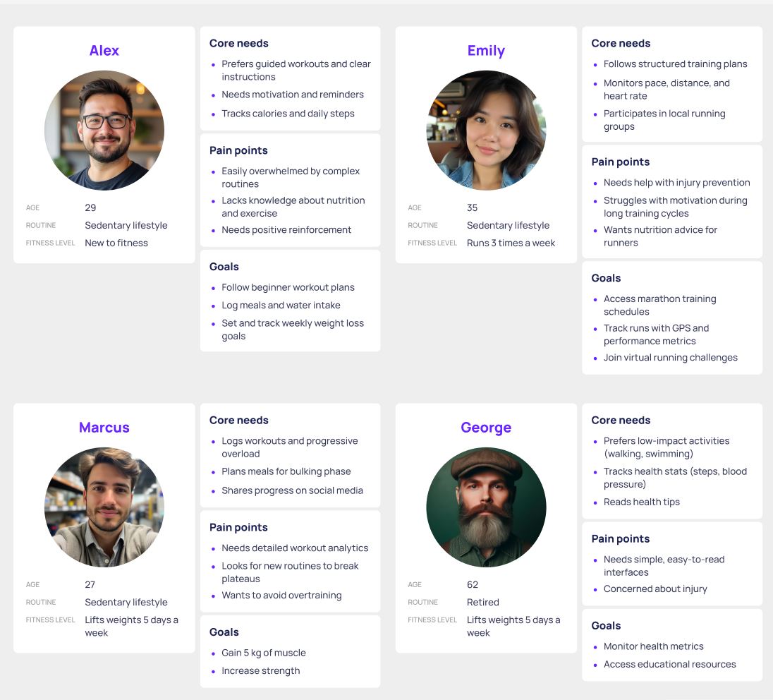
    01.Project description

    After the decision to build a unified, region-wide platform for collecting and analyzing industry data, our team was tasked with defining a scalable data-visualization design system that standardizes how insights are presented across products and teams. The objective was to ensure that every user—based on role, responsibilities, and access level—can quickly find the right metrics, understand performance at a glance, and drill into underlying drivers when deeper investigation is needed.

    We began by surveying as many prospective users of the new system as possible, focusing on the distinct needs of each role to identify a solution that would support the broadest set of workflows. This approach was critical because early on there was a risk that conflicting requirements could skew the design toward one primary user group, limiting the system’s value for everyone else.

    03. Findings

    Whereas most of our findings broadly aligned with initial expectations, they were still extremely valuable because they helped us build a more complete, end-to-end understanding of how the system would be used across roles, contexts, and priorities. They also validated which assumptions were safe to keep, and which required refinement before we committed to structure, terminology, and interaction patterns.

    Just as importantly, the research surfaced nuances that would have been easy to overlook—edge cases, informal workflows, and small frictions that rarely appear in high-level requirements but strongly influence day-to-day efficiency. By connecting these details into a holistic picture, we were able to spot gaps in our early thinking, anticipate points of confusion, and identify opportunities to design for consistency without ignoring role-specific needs.

    Naturally, the research pointed to two primary user groups with distinct goals and decision cycles.

    Engineers (operators)

    Engineers work closest to the machines and need reliable, real-time information that is immediately accessible at the point of action. Their priorities are speed, clarity, and confidence: current status, active alarms, short-term trends, and the ability to quickly confirm whether an intervention improved or worsened performance. Equally important, the data must be easy to share in horizontal workflows—engineer to engineer—so teams can align on the current situation, escalate issues, and collaborate on resolution without losing time to manual explanations.

    Performance and planning stakeholders

    The second group is focused on long-term performance and operational optimization rather than immediate troubleshooting. They need stable, trustworthy trends over time, consistent definitions of metrics, and the ability to compare periods, lines, or sites to evaluate progress and identify systemic issues. Drill-down remains essential, but primarily as an on-demand capability: they start from aggregated views to understand direction and impact, then zoom into contributing factors only when anomalies, risks, or opportunities require deeper analysis—supporting forecasting, capacity planning, and modeling future output.


    01.Proposal

    The proposed solution aligns with the ISA‑95 Enterprise–Control System Integration standard and supports hierarchical drill-down across the organization (e.g., Enterprise → Site → Area → Line/Cell → Machine/Device).

    At each level of the hierarchy, users can access multiple dashboard views tailored to the decisions and KPIs relevant at that scope. Visibility of specific datasets and modules is controlled through role-based permissions, ensuring users can view what they need to perform their responsibilities at each drill-down step—while restricting access to information outside their remit.

    The lowest levels of the hierarchy are designed as real-time data views, enabled by machines that are already equipped with real-time sensors.

    Engineers can also switch from live monitoring to short-term analysis—reviewing performance for today, this week, or this month—and comparing it with historical baselines. These comparisons often reveal early deviations in machine behavior, enabling earlier troubleshooting and helping reduce long-term maintenance costs.

    In addition, metric thresholds and alerts were introduced to warn users before values exceed recommended ranges. Over time, this supports proactive operation, reduces unnecessary wear, and helps minimize downtime caused by maintenance.


    Managerial and financial views are designed for aggregated, decision-oriented monitoring rather than second-by-second operation, giving leaders a reliable picture of performance across sites, areas, and lines. These levels prioritize consistent KPIs and clear comparisons between periods so managers can quickly identify where performance is improving, stagnating, or drifting off target.

    Managers can move from summaries to focused analysis by drilling down into the drivers behind changes—such as downtime categories, throughput constraints, quality losses, or utilization by shift/team—before launching corrective actions. This supports earlier intervention, better prioritization of improvement initiatives, and clearer accountability without requiring constant exposure to machine-level detail.

    On the financial side, dashboards translate operational signals into business impact by connecting performance with cost and value indicators (e.g., cost of downtime, scrap cost, energy spend, maintenance spend, and budget adherence). Thresholds and alerts can be set around cost-related metrics (for example, abnormal scrap-cost spikes or rising energy intensity), helping stakeholders spot financial risk early and validate the ROI of process changes.

    To support planning, managerial graphs also include an expected output prediction layer alongside actual performance. This makes it easy to see whether production is tracking above or below forecast, estimate end-of-period outcomes, and proactively adjust staffing, scheduling, or resource allocation when the projected trajectory indicates a risk to targets.
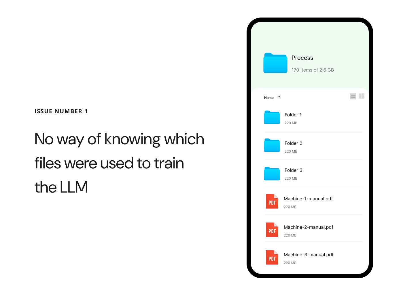

  • [ui] Re-designing file system for LLM’s

    [ui] Re-designing file system for LLM’s

    01. Introduction to the problem

    With implementation of AI to help employees find the necessary information they need more quickly, several practical challenges became clear.

    Our team was responsible for developing a solution to address these issues, aiming to make information retrieval simpler and more effective for everyday work.

    (My work is protected by an NDA, so this explanation focuses on my thought process and strategy rather than specific details)

    Project Timeline and Methodology

    The project was executed during Q2 of 2024, following an agile methodology. The core user research and prototyping phases were efficiently structured into four iterative sprints spanning a total of eight weeks. Throughout these sprints, our cross-functional team conducted comprehensive user interviews and usability testing to inform the design direction. Rapid prototyping and continuous feedback loops enabled us to validate design hypotheses early and iterate on key interface components, ensuring alignment with both user needs and business objectives.

    Team Structure and Collaboration

    The core UX/UI team consisted of three dedicated designers who collaborated closely with a larger, multidisciplinary development team. Leveraging agile ceremonies and regular cross-functional syncs, the designers drove user-centered decision-making throughout the project lifecycle. This collaborative structure enabled seamless hand-off between design and development, ensured rapid iteration on interface solutions, and fostered alignment on key usability and technical requirements.

    02. Core issues

    After engaging in collaborative sessions with both prospective users and the technical team, we identified several UX/UI constraints that could significantly impact the success of our project if not proactively addressed. These constraints highlight potential usability challenges and technical limitations that must be considered during the design and development phases to ensure a seamless user experience and efficient implementation.

    System of Tags

    Because the model is only trained at certain times, files uploaded to the server are not automatically tagged, making it impossible to tell which files have already been processed and which are new. This leads to operational inefficiencies and potential data redundancy.

    Outdated documentation

    When updated or changed files are added, there’s a risk that the AI will continue to provide information based on outdated data, even though the new files are visible in the database.

    Different user experience

    When updated or changed files are added, there’s a risk that the AI will continue to provide information based on outdated data, even though the new files are visible in the database.

    03. Constrains

    1. Model Retraining Constraints and Data Recency
      Given the complexity and high cost associated with fully retraining the model, the team needed to anticipate scenarios where the model might be operating on outdated data. To mitigate risks, it was essential to implement clear warnings for employees when they might be working with potentially deprecated information.
    2. User Learning Curve and System Design
      The introduction of new features presents employees with a novel user experience. To minimize the need for extensive training, the team prioritized designing a system that is simple and easy to use. However, given the advanced capabilities of large language models (LLMs), some level of user guidance or training may still be necessary to ensure employees can fully leverage the system’s potential.
    3. Technical Limitations and Collaborative Implementation
      The team recognized the importance of close collaboration with engineers and back end architects to fully grasp the technical aspects of the proposed solution. This partnership was crucial for developing a vision that could be implemented in an intuitive and coherent manner, despite existing technical constraints.

    04. Implementation

    Our primary objective was to design an interface that enables users to work with files in a manner that is immediately intuitive and easy to understand. The focus was on minimizing cognitive load, ensuring that users can navigate, locate, and interact with files without confusion or unnecessary steps.

    User Experience Emphasis

    A significant emphasis was placed on crafting a user experience that unmistakably communicates the chat’s sole purpose: to facilitate straightforward and intuitive file search. Every design decision, from layout to micro-interactions, was guided by the principle of clarity and simplicity.


    Key UX/UI Strategies

    Clarity of Purpose: The interface employs clear visual cues and concise messaging to reinforce that the chat is dedicated exclusively to file search, reducing the risk of user misinterpretation.

    Intuitive Navigation: File search and access pathways are streamlined, with familiar icons, logical grouping, and minimal steps required to complete core tasks.

    Consistent Interactions: Interactive elements behave predictably, supporting user confidence and reducing the learning curve.

    Feedback and Guidance: Real-time feedback and contextual hints help users understand available actions and system status at every step.

    Smart system of uploading files


    File Reference and Easy Access

    This UX pattern is crafted to clearly indicate that the provided answer is sourced directly from a specific file, ensuring transparency and traceability for users. The design emphasizes both the origin of the information and the ease with which users can access the complete file for further exploration.

    Key Features

    Clear File Attribution: Each answer prominently displays the file name or identifier, making it immediately obvious where the information originates.

    Direct Access Link: A visible and easily accessible button or link allows users to open the full file with a single click, reducing friction and supporting deeper investigation.

    Contextual Preview: The answer may include a snippet or preview from the file, giving users context before they decide to open the entire document.

    Consistent Placement: File references and access controls are consistently positioned within the interface, ensuring users always know where to look for source information and access options.

    Contextual File Navigation

    When a user clicks on a reference within the answer, they are seamlessly redirected to the specific file where the referenced information resides. To enhance clarity and user orientation, the exact portion of the content that was referenced is automatically highlighted within the document.

    Key Features

    Direct Navigation: Clicking the reference takes the user straight to the relevant file, eliminating unnecessary steps and reducing cognitive load.

    Automatic Highlighting: The specific text or section cited in the answer is visually highlighted, making it immediately easy for users to locate and understand the context.

    Smooth Transition: The transition from the answer to the file view is designed to be smooth and intuitive, maintaining user focus and minimizing disruption.

    Consistent Feedback: Visual cues (such as animations or color changes) confirm that the user has been redirected to the correct location within the file.

    This scenario demonstrates the implementation of both static and dynamic system notifications within an AI-driven workplace solution. The notifications are designed to transparently inform users about potential limitations in the system’s responses—specifically, the possibility of receiving inaccurate answers depending on the context or underlying data integrity.

    When a user submits a query, the system proactively scans its database to assess the relevance and currency of available information. In this instance, the system identifies that a file referenced in the query has been marked as deprecated. Leveraging intelligent database integration, the system autonomously locates the most current iteration of the file and integrates it into the contextual window for the user’s review. This process occurs seamlessly, without requiring any manual intervention from employees, thereby maintaining workflow efficiency and minimizing disruption.

    Key UX/UI considerations in this scenario include:

    Proactive Information Management: The system dynamically updates its response context based on real-time data status, ensuring users always interact with the most accurate information available.

    Transparent Communication: Static and dynamic notifications are used to inform users of data limitations, fostering trust and setting clear expectations about answer reliability.

    User-Centric Automation: By automating the retrieval and integration of updated files, the system reduces cognitive load and manual effort for employees, aligning with best practices in user-centered design1.

    Contextual Awareness: The solution intelligently adapts to changes in underlying data, demonstrating robust integration between data management and user interface layers.

    Summary

    This approach exemplifies how thoughtful UX/UI design and intelligent system architecture can work in tandem to deliver efficient, reliable, and user-friendly AI solutions in the workplace1.

    This project introduced a completely new design solution, which means there was no existing benchmark or reference point for user satisfaction prior to its implementation. As a result, initial assessments focused primarily on establishing a baseline for user experience and interface effectiveness. Following the launch, targeted user feedback was collected to evaluate satisfaction and identify areas for improvement. The feedback revealed a strong overall satisfaction rate of 93%, indicating that the new design has been well received by the user base.

    However, critical feedback highlighted several weaker points, most of which stem from technical limitations rather than design flaws. These findings suggest that while the user experience is robust from a design perspective, future enhancements should consider both user expectations and technical feasibility to further optimize the solution.

  • [ui] UX/UI Design for a Fitness App with AI Functionality (Part 1)

    [ui] UX/UI Design for a Fitness App with AI Functionality (Part 1)

    01. Introduction and context

    In an increasingly competitive market—where up to 70% of fitness app users abandon fitness products within the first 90 days—effective UX/UI design is not just an enhancement but a necessity for engagement and retention. The integration of AI further elevates expectations, enabling personalized workout plans, real-time feedback, and adaptive coaching that cater to individual needs and preferences

    This report details the process of designing the UX/UI for a fitness app enhanced with AI features, highlighting the principles, methodologies, and best practices that drive user satisfaction and long-term engagement in the digital fitness landscape.

    02. Market analysis

    The landscape of fitness applications has evolved rapidly, yet many users still struggle to find platforms that provide comprehensive guidance and meaningful support. Traditional fitness apps often focus narrowly on tracking workouts or counting calories, leaving significant gaps in the holistic management of well-being. Recognizing these shortcomings, our team embarked on the design of a next-generation fitness app in autumn 2024, aiming to redefine user experience through the integration of advanced AI functionalities.

    Our core motivation stemmed from two critical observations. First, existing fitness solutions frequently lack the depth of personalized guidance that users need to achieve sustainable results. Second, there is a growing demand for a holistic approach—one that seamlessly integrates data from multiple aspects of daily life, including nutrition, sleep, and exercise. By gathering and analyzing this multifaceted data, our app leverages AI to deliver tailored feedback, actionable insights, and adaptive recommendations, empowering users to make informed decisions and foster long-term healthy habits.

    The project analysis, conducted during a period of unprecedented growth in AI technology, provided invaluable insights into the challenges and opportunities present in this dynamic field. Navigating the complexities of AI integration—especially as the technology rapidly advanced—was both a fascinating and essential learning experience. Our focus remained on designing a user interface and experience (UX/UI) that is not only intuitive and engaging, but also capable of translating sophisticated AI-driven analytics into clear, supportive guidance for users at every stage of their fitness journey.

    By prioritizing user-centric design and holistic data integration, our fitness app aspires to set a new standard for digital health platforms, offering a level of personalized support and motivation that traditional apps have yet to achieve.

    03. Understanding the user

    To ensure our fitness app addressed real user needs, we conducted a targeted user survey as an early step in our design process. We crafted a concise, mobile-friendly questionnaire focusing on users’ current fitness habits, their motivations and challenges, and their experiences with existing fitness apps. The survey included a mix of multiple-choice and open-ended questions to gather both quantitative data and personal insights.

    We distributed the survey through social media fitness groups, online forums, and our personal networks to reach a diverse audience ranging from fitness beginners to experienced athletes. Over the course of one week, we collected 120 responses. The results highlighted key pain points such as lack of personalization, difficulty maintaining motivation, and confusion around tracking progress. These insights directly informed our feature prioritization and the integration of AI-driven personalization within the app.

    1. Progress Tracking and Guidance Are Essential

    A large majority want clear progress tracking (85%) and guided workout plans (80%), indicating these should be core features. Users value knowing what to do and seeing their improvement.

    2. Motivation and Time Management Are Major Challenges

    The top challenges are staying motivated (30%) and finding time (26%). Features that boost motivation (reminders, streaks, gamification) and help users fit workouts into their schedules will address key pain points.

    3. Personalization and Simplicity Drive Satisfaction

    Users dislike complicated interfaces and lack of personalization. They seek easy-to-use, tailored experiences that adapt to their goals, fitness level, and preferences.

    4. Most Users Are Experienced with Fitness Apps, But Want More

    With 85% having used fitness apps, users are familiar with the basics but desire better integration, more personalized plans, and fewer ads or upsells. There’s an opportunity to stand out by focusing on user-centric design and value.

    To succeed, the fitness app should prioritize intuitive progress tracking, personalized guidance, motivational tools, and a simple, user-friendly interface. Addressing motivation and time challenges will help users stay engaged and achieve their goals.

    04. User Insights

    The landscape of fitness applications has evolved rapidly, yet many users still struggle to find platforms that provide comprehensive guidance and meaningful support. Traditional fitness apps often focus narrowly on tracking workouts or counting calories, leaving significant gaps in the holistic management of well-being. Recognizing these shortcomings, our team embarked on the design of a next-generation fitness app in spring 2024, aiming to redefine user experience through the integration of advanced AI functionalities.

    05. Market Analysis

    We analyzed top fitness apps by reviewing their features, user interfaces, and use of AI. Our focus was on onboarding, workout recommendations, and progress tracking. We identified common strengths, such as clean design and motivational tools, but also noticed gaps—especially in personalized, adaptive feedback and more holistic view on health. These findings helped us spot opportunities to differentiate our app with smarter, more tailored AI features.

    Product Vision

    The core goal of our fitness app is to deliver a truly personalized and motivating fitness experience that adapts to each user’s unique needs and goals. At the heart of our value proposition is the promise of accessible, expert-level guidance—anytime, anywhere—empowering users to achieve better results safely and efficiently. By leveraging AI, the app can generate custom workout and nutrition plans, track progress with precision, and provide real-time feedback on form and performance, all tailored to individual fitness levels, preferences, and evolving routines.

    AI is central to enhancing the user experience, setting our app apart from traditional fitness solutions. Features like computer vision enable real-time posture correction and instant coaching using only a smartphone camera, while predictive analytics adjust routines and goals based on actual progress and health data.

    Seamless integration with wearables, adaptive difficulty, and natural language feedback create a responsive, supportive environment that feels like having a personal coach in your pocket. These differentiators—hyper-personalization, intelligent feedback, and adaptive coaching—position our app as a next-generation fitness solution in a crowded market.

    Key Features (MVP)

    The MVP includes an AI-powered personalized workout generator that tailors exercise routines to individual needs, a progress dashboard for tracking achievements and milestones, smart reminders to keep users engaged and consistent, and a simple, motivating on-boarding process designed to quickly guide new users into effective fitness habits.

    06. User Journey

    Based on comprehensive user research, we developed a detailed user journey map to identify and address user needs at every stage of their interaction with our product. This journey map enables us to pinpoint pain points, moments of delight, and opportunities for improvement, ensuring a seamless and supportive experience throughout the entire user lifecycle.

    Key Objectives

    Holistic Understanding: Gain a 360-degree view of user behaviors, motivations, and challenges.

    Targeted Support: Identify critical touchpoints where users may need additional guidance, resources, or reassurance.

    Continuous Optimization: Use journey insights to inform iterative design improvements and enhance overall usability.

    Application in UX/UI Design

    Empathy-Driven Solutions: Design features and interactions that directly address user needs uncovered during research.

    Proactive Assistance: Integrate contextual help, tooltips, and onboarding flows at key stages to support users proactively.

    Feedback Loops: Ensure users have clear channels to provide feedback, allowing us to refine the journey further.

    07. Reflections

    This project highlighted the critical role of thorough user research in the design process. Although I am personally familiar with similar applications, I realized that my own experiences did not reflect the full spectrum of user behaviors, needs, and expectations. Engaging directly with diverse users uncovered unique perspectives and pain points that I hadn’t previously considered.

    This experience reinforced my commitment to incorporating deep user research into every stage of the UX/UI process, ensuring our designs are grounded in genuine user insights rather than assumptions.

    Part 2: Prototyping and User Testing is coming soon

    P.S. My work is protected by an NDA, so this explanation focuses on my thought process and strategy rather than specific details

  • [ui] Design for Fitness app with AI features (Part 2)

    After establishing a clear product vision and understanding user needs, we transitioned to the design and validation phases, beginning with the creation of wireframes. Our initial focus was on mapping out the app’s core structure, prioritizing intuitive navigation and logical user flows. We sketched low-fidelity wireframes for key screens—including onboarding, personalized workout selection, progress dashboards, and AI-powered feedback modules. These wireframes allowed us to experiment with different layouts, information hierarchies, and interaction patterns without getting bogged down in visual details. By keeping the wireframes simple, we could quickly iterate and gather early feedback from both stakeholders and potential users, ensuring that the foundation of the app was solid and user-centric.

    With the wireframes in place, we moved on to building interactive prototypes. These mid-fidelity prototypes brought the app’s core functionalities to life, enabling us to simulate real user interactions such as customizing a workout plan, tracking daily activity, and receiving instant AI-generated coaching tips. We recruited a diverse group of test users—ranging from fitness newcomers to experienced athletes—to participate in usability testing sessions. Users were asked to complete common tasks, such as signing up, setting fitness goals, starting a workout, and reviewing their progress. Throughout these sessions, we closely observed user behavior, noting any points of confusion, hesitation, or friction within the interface.

    User feedback from prototype testing proved invaluable. Testers appreciated the personalized elements and AI-driven suggestions but highlighted areas for improvement, such as clarifying navigation between sections and making progress tracking more visually engaging. We also discovered the importance of providing clear, actionable feedback during workouts, especially for users unfamiliar with certain exercises. Based on these insights, we refined the flow of the app, enhanced visual cues, and adjusted the placement of key features to improve discoverability and ease of use.

    This iterative, user-centered approach to wireframing and prototyping ensured that our design decisions were grounded in real user needs and behaviors. By validating concepts early and often, we minimized the risk of costly changes later in development and set the stage for a seamless, engaging, and highly personalized fitness experience powered by AI. The next phase will focus on developing high-fidelity visuals and integrating advanced AI features for further testing.